- Visual Identity
- Web Development
I worked with Gransud, an Argentinian company specialised in manufacturing machinery for the wine industry, in the transformation, renewal and launch of their revamped visual identity.
Research and Planning
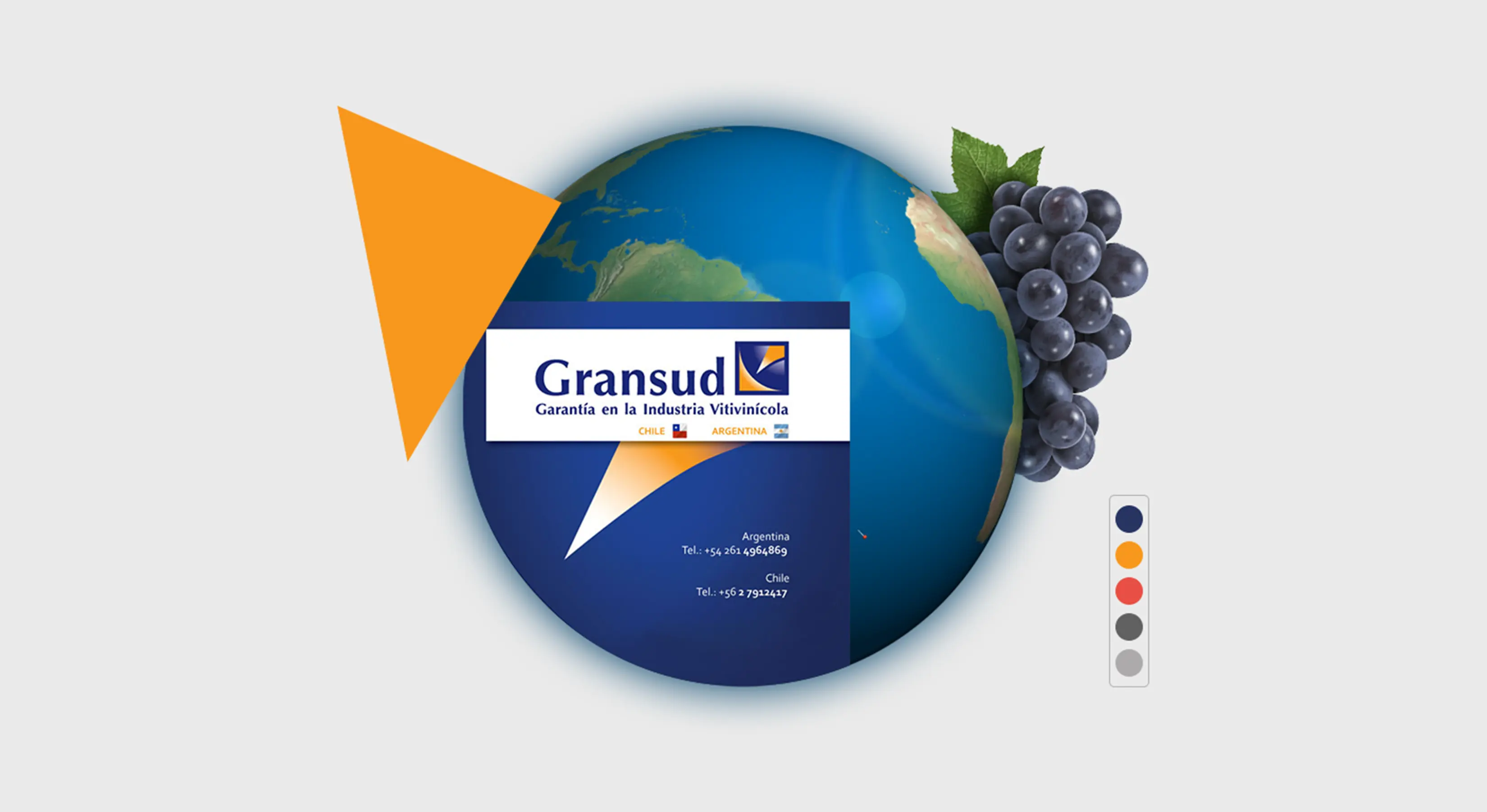
The company already counted on an existing visual identity composed of a logo, a colour palette and typography. It was an excellent opportunity to deeply explore, unassemble and recompose those assets into a renovated visual identity.

Visual Identity
I worked meticulously to create a brand mark that could represent the Southern Cone —the southernmost area of the American continent— and bridge the previous design with the renovated company's values. I applied simplification processes and closing law techniques to get a brand mark that could instantly identify Gransud and sustain the brand's image.

Due to the company's intent of projecting a renovated image in the wine industry, I considered revamping the wordmark's existing typeface Optima, designed by Hermann Zapf between 1952 and 1955. Instead, I replaced it with Avenir, a classic-style sans serif typeface, very elastic and legible, to provide the logo with modern traits.
The final proposal is the perfect balance between a simple but visually enticing brand and a clean and modern font.
Bespoke Web Development
One of the biggest challenges in developing the website was the vast number of products the company offered, which included both machinery and supplies for the wine industry. I developed a bespoke CMS in PHP and MySQL to allow the company to upload, edit and delete the site's content without dealing with complicated and intricate CMS dashboards.
Marketing Materials
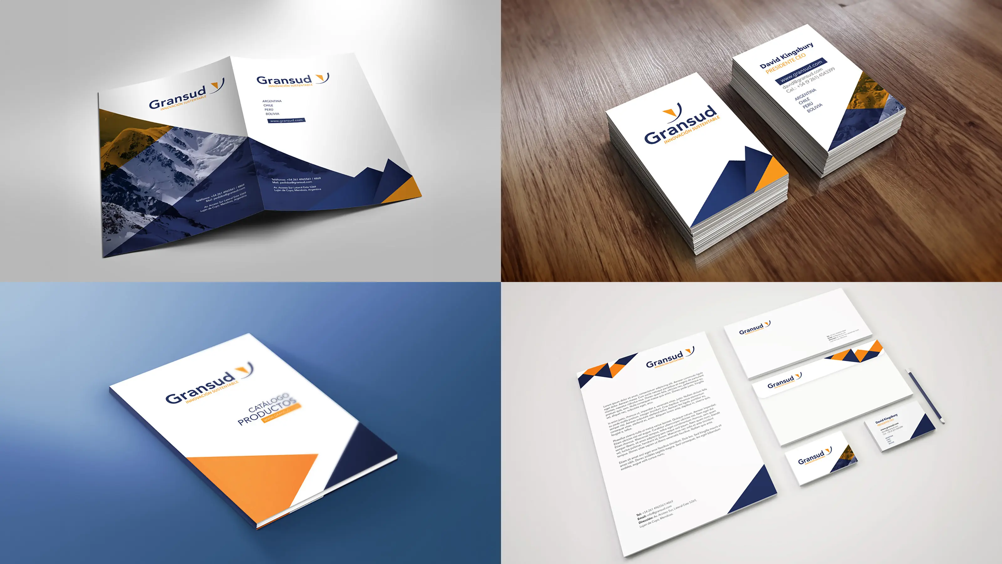
I designed and delivered a wide range of print assets that align the brand's graphical manifestations into eye-catching visual language. The angular shapes representing the Andes belt of mountains and the interaction of corporate colours with photography provide the graphic system uniqueness and recognition.

Project Outcome
The new visual identity helped the company project their commercial efforts with a renovated image and a more modern approach. At the same time, the website and the printed catalogue allowed a more organised categorisation of the machinery and supplies offered by the company, which positively impacted sales presentations and later conversions.